Samsung S23A750D 3D LCD Display
by Chris Heinonen on December 17, 2011 2:45 PM ESTSamsung S23A750D Viewing Angles and Color Quality
The Samsung is a TN panel but Samsung advertises improved viewing angles as one feature of the S23A (with the name "Magic Angle Vertical"); you can read about this and additional features on their product page. As you'd expect there's plenty of marketing hyperbole to be found, but in practice I did notice that the S23A has better viewing angles than competing TN solutions.


Most TN panels experience huge color shifts when viewed from the top or bottom of the monitor, and once they get past 20” or so in size you start to see the shift even when attempting to view straight on; by comparison, the S23A looks good when viewed straight on and I didn't see noticeable shifts from my normal viewing area. However, this remains a TN panel and when viewed from accute angles the shift in color and contrast is still present.
Unfortunately, while viewing angles are better than most TN displays, the pre-calibration Delta E numbers are as bad as we've come to expect from consumer displays.
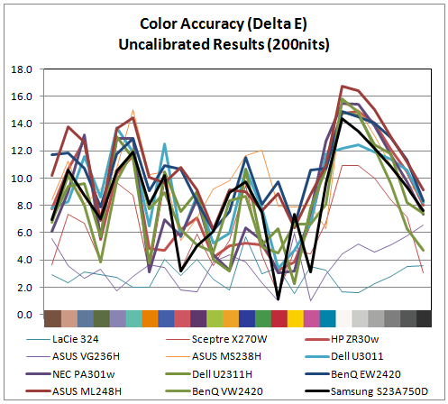
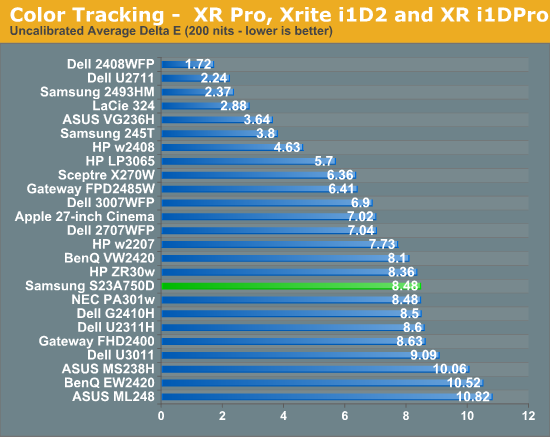
With an average dE over 8 and some of the worst overall numbers occurring the grayscale, the initial numbers for the Samsung aren't very good. The result is similar to competing displays, but still disappointing. Let's move on to calibrated results.
Using the color settings to get the white balance as close as possible to D65 and then setting the brightness and contrast to get 200 nits of light output, I ran the calibration routine in ColorEyes Pro to see if the Samsung could perform any better.
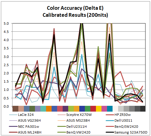
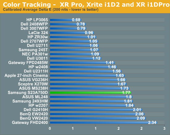
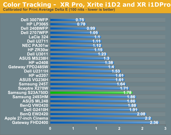
The numbers for the Samsung are overall very good once calibrated. Not only do we get an average dE of 1.77, but the only large errors at all are once again in shades of blue, including the shade of cyan that falls outside of the sRGB spectrum. The entire grayscale spectrum is under 1.0 dE, and only 3 of the 24 swatches are above dE 3, which is the visible level if ColorEyes uses dE76 (which I’d assume, but can’t confirm). Hopefully in the near future we will be able to get all these results in dE94, which is more accurate for measuring color error. I also went ahead and did the same test, though at 100 nits instead of 200 nits, which is what might be used if you are doing print work.
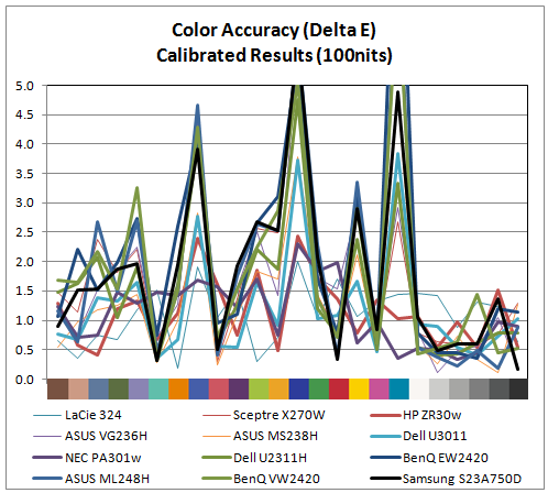
Here the performance is almost identical to the 200 nits data. The grayscale isn’t quite as good, but still virtually perfect, and almost all the issue falls at the same three sample points. Overall the performance here was much better than I expected from a TN panel.


80 Comments
View All Comments
DParadoxx - Saturday, December 17, 2011 - link
Chris, there is an OCZ 850 PS gallery on page one. I suspect this is unintentional.DParadoxx - Saturday, December 17, 2011 - link
Spoke too soon, I see it is.Iketh - Saturday, December 17, 2011 - link
Sorry to be a d**k, but I could only glance through the article. It felt like is was written by a 7th grader. Not AT worthy.MonkeyPaw - Saturday, December 17, 2011 - link
I'm sure your thoughtful and constructive comment will really be a force for change at AT.Kristian Vättö - Saturday, December 17, 2011 - link
It's really no use to criticize unless you can be more specific. What is wrong with it? The writing style or the knowledge of the writer? Or something else?Haters are always gonna hate. If you want things to change, the way is to provide feedback and tell WHAT IS WRONG.
Galcobar - Saturday, December 17, 2011 - link
The writing style is more juvenile, hyperbolic and chatty than I've come to expect from Anandtech. There are also some grammatical issues which obscure meaning. As a result the reader has to sift the article more carefully for the relevant information.Clear, concise writing which conveys the information precisely indicates a greatery mastery of the subject material. The author may have a complete grasp of the issue, but it is not presented in a manner which would lead the reader to trust the author's, erm, authority.
MonkeyPaw - Saturday, December 17, 2011 - link
That's a much better way to put it. Nice ironic twist in there too. :pReikon - Sunday, December 18, 2011 - link
Yep. I've been saying recently that AT is going down in quality. These new writers just aren't any good. Their writing style and content just isn't up to the old standards.I mean, look at those pictures of the OCZ PSU on the first page. Someone even thought they were included as an error. This isn't a blog. Don't write about how your computer couldn't handle 3D and then detail how you upgraded it to support it. This isn't a case or PSU review. We don't need to know the details of your PSU installation for a monitor review.
claytontullos - Sunday, December 18, 2011 - link
agreedjohnf1285 - Monday, December 19, 2011 - link
I agree with this too. I was thrown off when I was reading through the article, and glanced down to see a photogallery with pictures of a PSU.